Oregon Community Foundation
Oregon Community Foundation needed a new brand identity, visual system and digital presence that better reflected their mission and increased awareness of their impact in the philanthropic community.
Role
Design lead, brand + Digital
Agency
Smith & Connors
The Logo
OCF (Oregon Community Foundation) serves the entire state of Oregon, is rooted in diverse communities and is a trusted steward of assets.
The primary logo was built to emphasize the three units within the name; Oregon, Community and Foundation. The three words are vertically stacked and framed by a line that remains open and accessible – reflective of their values of collaboration, inclusivity and community.
The small square at the start of the line anchors the mark and indicates the beginning of a journey. A customized serif typeface provides a friendly, trusting and historic tone.
System Identity
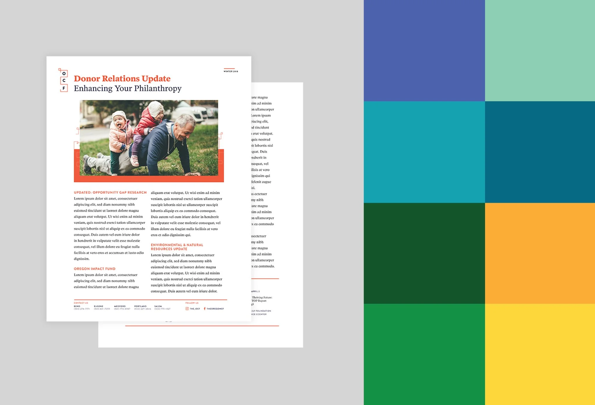
Layering elements of photography, pattern and color form the structure for the brand expression. Photography reflects community, pattern borrows from the primary logo to create a mesh of connection and finally color is assigned to the 8 regions served in Oregon.
Digital extension
When extending the visual brand into the digital platform the same three foundational elements were used (photography, pattern and color).
The goal of the website was to take a complex amount of information and provide the users with a clearer understanding of who OCF is and what OCF does. The simplification of information and navigation also allowed for users to access relevant and meaningful information faster.


